Artwork: Digital Collage
|
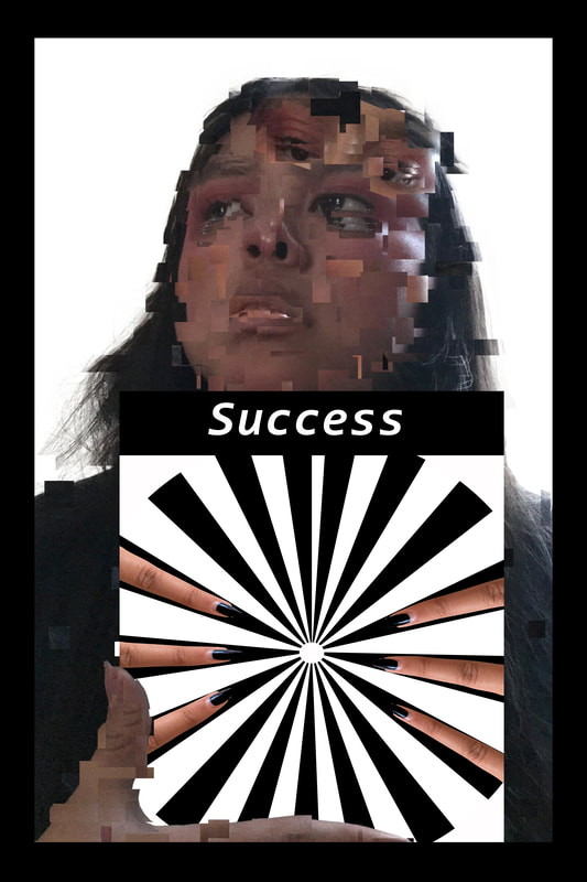
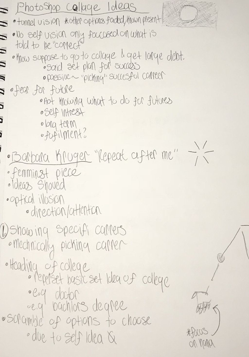
Title: Scramble for Success
|
Exhibition Text:
“Scramble for Success” is an expression of my struggles in determining my future. As in general I fear I'll chose a lackluster major, currently. I also dislike the idea of beginning my adult life on paper with debt due to college. Influence came from a piece made by Barbara Kruger and Iasonas Kampanis. The use of the optical illusion represents forced upon ideas. While the face distortion represents ones scramble. Aspects of the digital collage such as border and text were made within Photoshop.
Inspiration/Critical Investigation:
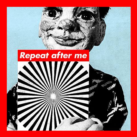
Kruger, Barbara. Untitled (Repeat after me). 1985. Silkscreen on Vinyl. |
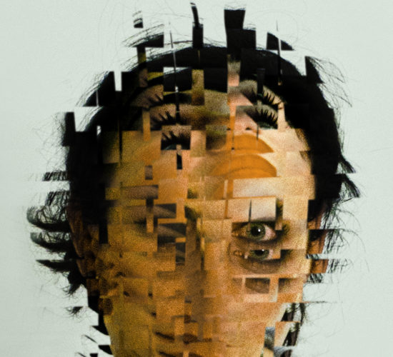
Kampanis, Iasonas. Portrait V. 2014. Digital Manipulation. |
For my artwork I had two sources of particular inspiration. A primary and initial source of inspiration for my art work as Barbara Kruger’s “Repeat after me”. A style comparison can be made from the two pieces. In Kruger’s work there is a consistent use of bold text and borders. This particular style is used within my artwork. Even the use of minimal wording to convey a central concept are similar. For instance Kruger uses the phrase “Repeat after me”, which can allude to one concept/ idea. This served as inspiration for my artworks phrase of success which alludes to the central idea of my artwork. Another comparison can be made on the use of a spiral as a center. This aspect of Kruger's piece served as inspiration for my particular use of the spiral. As the basis of the design are alike in meaning and style. The use of the optical illusion with the heading of it motives do compare. They both serve as a expression of allude to ideals forced upon one.
My artwork contrast from its source of inspiration. In deeper meaning there is a difference in meanings. In this particular artwork Kruger’s meaning is feminist. The overall idea of the piece is convey the forced ideas and ideals forced upon women. This idea is presented through the optical illusion, of these concepts becoming accepted. Though in contrast I use the optical illusion as inspiration to serve a different purpose. This is to convey the idea of success being conveyed through one road. As we are set up to go to collage right after high school. Another contrast of the artworks is technique in medium. Kruger used a silk screen on vinyl for her artwork. While my piece is a digital collage. This difference is present partial due to time periods of the artworks being created. As Kruger's work was made in 1985, while my artwork was made in 2018 through Photoshop.
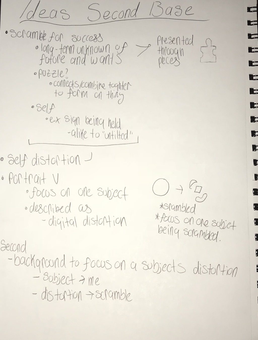
From my second source of inspiration comparisons and contrasts can be made. For instance both techniques and mediums are similar. Kampanis “Portrait V” was created in 2014, while my artwork was made in 2018. There is a closeness in time between both artworks. This leads into the type of medium of the pieces. Overall there is a similar use of digital manipulation of the original photography. This served as inspiration for my piece through Kampanis particular use of manipulation. Though there is a contrast in style of the artworks. As Kampanis piece focus on one particular subjects manipulation. This served as basis of inspiration for my work though did not compare but rather contrast in style. As my artwork uses multiple forms to convey a holistic meaning of struggle of success ideas.
Planning:
|
|
|
Process/Techniques/Experimentation:
Process
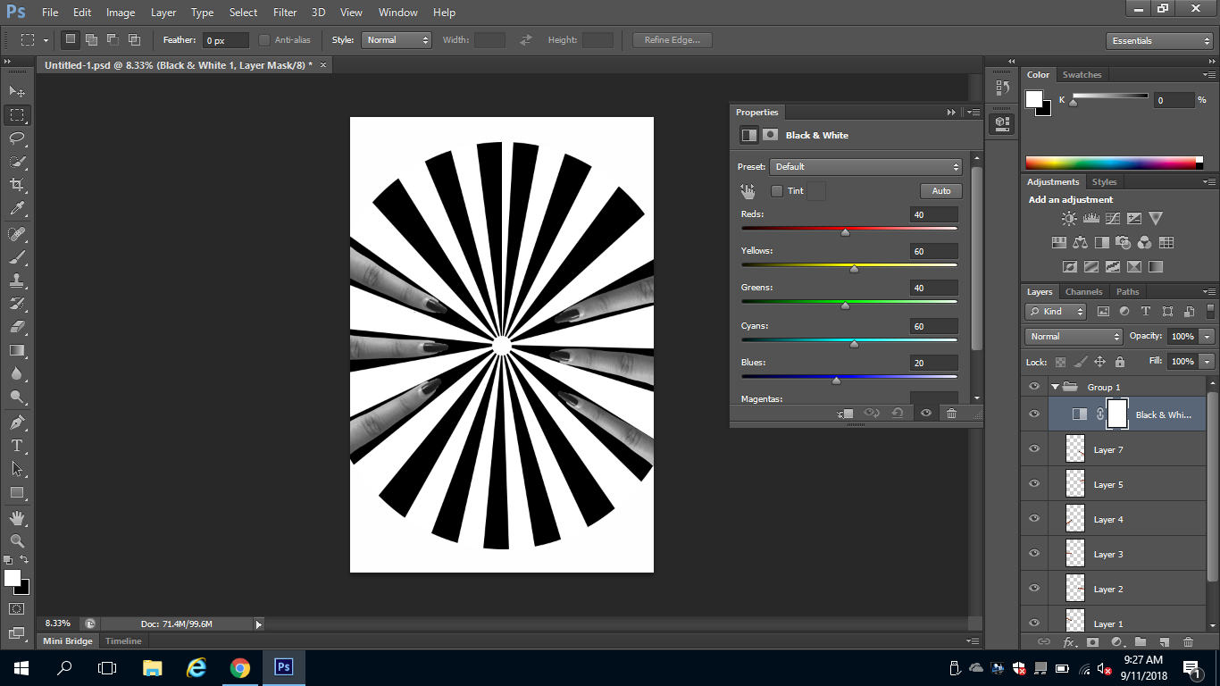
The piece was made in Photoshop. To begin a ratio setting was set for the image as 24" by 36" with a resolution of 170. It was also set as a colored black background. This was done in order to achieve the specific spiral design. The foreground and background colors selected(black an white) can be see to the bottom left of the images. This color scheme is also constantly used throughout the artwork. Though in order to achieve the basic background of the first digital created in Photoshop, this was used. First filter,distort and then wave was selected. The specific settings were changed in order to fit within the image size. The goal of this is to create straight vertical lines. Next Filter and then polar coordinates was selected. This was done into the center of the image. This achieves a full screen starburst effect. Finally the circle tool is selected as a inverse fill. This is done in order to achieve the white background and spiral circle. This is then set as a locked background in order to be fixed.
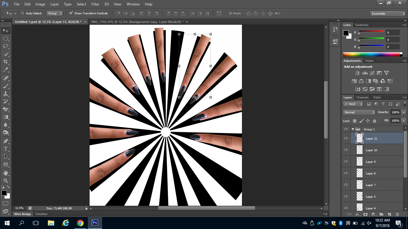
Next the pointer fingers are added from a separate image. It was cut using the quick select tool. This process was made simple due to the image being taken on a contrasting background from the finger. The edge was then refined with refine edge. Then the same finger was used around the spiral through pasting. Some manipulation was used on the fingers in order to lengthen or shrink to fit within one section. They are also placed in order to not show the cut part of the finger but rather have it cut with the spiral. Lastly the eraser tool was used on the finger tips. This was done in order to darken and fade the polish into the black background of the spiral. Then the top heading is added to the first digital collage.
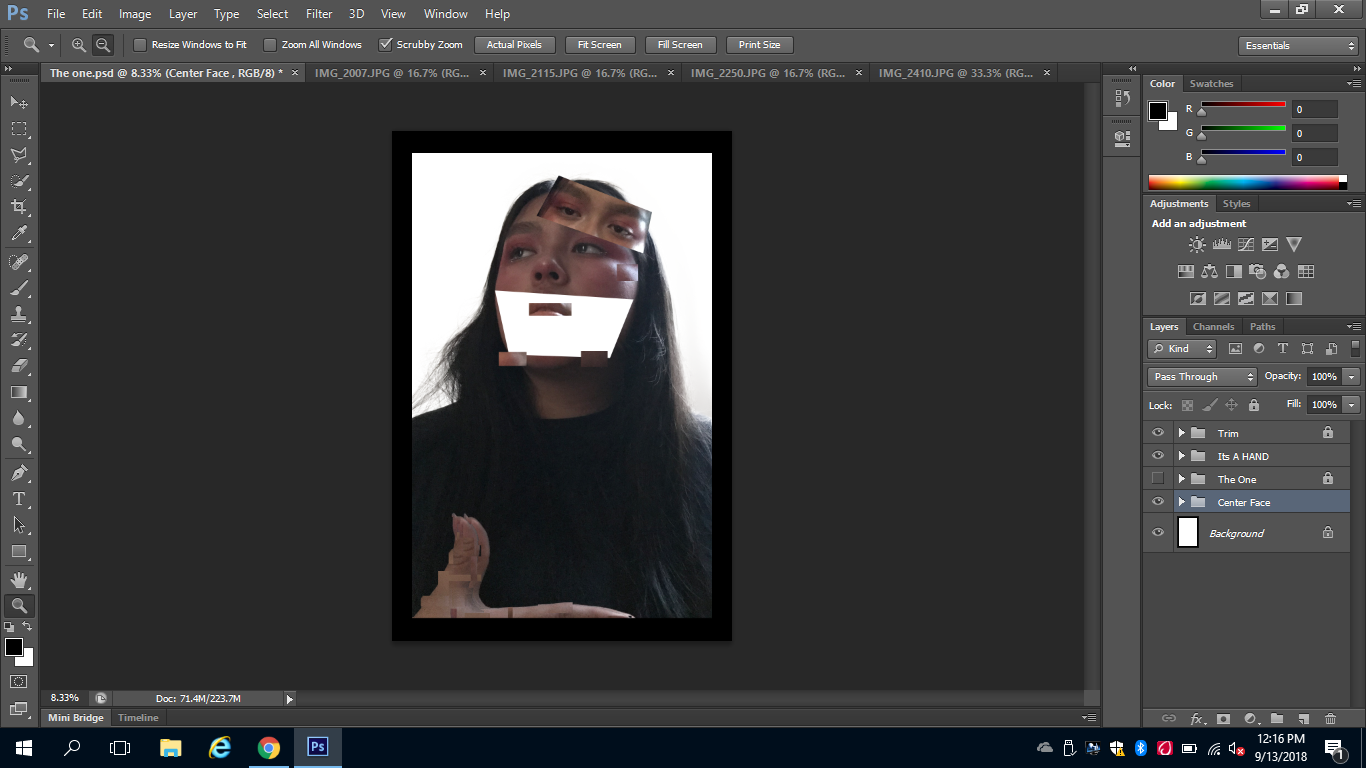
To begin the second digital collage another image is created with the a white background. The first one is added to the bottom of the second digital collage. The black border is then added and locked as a background. The text of "success" is also added in order to ensure it will look proportional in the second digital collage.
A new layers then created for the face, it is positioned within the background. This similarly cut as the fingers were. A contrasting background was used on the original was used in order for the quick select tool to be used efficiently. This is done for the face, body and hand. Though a copy of the hand holding the sign is made. This is done in order for it to appear in front of the sign. This is the distorted using copy and paste from the image used currently. Three other images were also used in order to add to the current used. This can be seen in the second digital open tabs. This is especially used on the face. The set of eyes is then copied, edit, and flipped to the forehead. The copy or the original or three other image is selected. Then it is deselected and placed onto the digital collage. This process is repeated through the face, body,hair and hand for the person.
Next the pointer fingers are added from a separate image. It was cut using the quick select tool. This process was made simple due to the image being taken on a contrasting background from the finger. The edge was then refined with refine edge. Then the same finger was used around the spiral through pasting. Some manipulation was used on the fingers in order to lengthen or shrink to fit within one section. They are also placed in order to not show the cut part of the finger but rather have it cut with the spiral. Lastly the eraser tool was used on the finger tips. This was done in order to darken and fade the polish into the black background of the spiral. Then the top heading is added to the first digital collage.
To begin the second digital collage another image is created with the a white background. The first one is added to the bottom of the second digital collage. The black border is then added and locked as a background. The text of "success" is also added in order to ensure it will look proportional in the second digital collage.
A new layers then created for the face, it is positioned within the background. This similarly cut as the fingers were. A contrasting background was used on the original was used in order for the quick select tool to be used efficiently. This is done for the face, body and hand. Though a copy of the hand holding the sign is made. This is done in order for it to appear in front of the sign. This is the distorted using copy and paste from the image used currently. Three other images were also used in order to add to the current used. This can be seen in the second digital open tabs. This is especially used on the face. The set of eyes is then copied, edit, and flipped to the forehead. The copy or the original or three other image is selected. Then it is deselected and placed onto the digital collage. This process is repeated through the face, body,hair and hand for the person.
Techniques
Different techniques were used in order to create this type of piece. To start of I had a basic understanding of the components within Photoshop. This caused an initial issue in creating the spiral circle within Photoshop. I chose to just start off with a starburst design and then form it into a circle. This was more precise than hand making the design digitally within Photoshop. This specific design was also created due to inspiration from Kruger's work. Another technique was used when taking photos, in order to make cutting simple. This was using contrasting backgrounds in the photography. Lastly the cutting and pasting technique in order to create the specific square style of distortion. This was inspired from Kampanins work of digital distortion. This added to the meaning of scramble and confusion within the artwork. Though this was time consuming, it did accomplish the goal. Bellow are some of the tools used throughout completing the digital collage.
Reflections/ CritiqueIn reflection to the process used above, adjustments could be made. More tools could have been used to experiment with in Photoshop. If done well this could have added more elements to the final piece itself. Though much time was exhausted in attempts to create elements within Photoshop. This includes the trial and error process in the developing on the optical illusion. This is also a critique on how the initial plans for the circle where set. As at first it was going to made line by line within Photoshop. Though experimentation and research allowed for the circle to be more precise. In the future initial plans should be set for a balanced central element for the artwork. In this case using correct measurements and experimenting more, prior to starting the artwork.
|
Evaluations Barbara Kruger's artwork served as the main source of inspiration for me. This can be seen through the central subject of the piece which is he spiral. It is also present in the type of style used through borders and text. Within the piece Kruger consistently uses the same color scheme. This includes the monotone and the red. There is also a contrast present on the sign being flat, while the doll holding it being three dimensional. While my piece follows the same aspects on the flat and dimensions of that holding the sign. Though in evaluation to my piece less shadows are present through lighting.
Kampanis served as a second source of inspiration for my artwork. As the basis elements of distortion for one, to represent ones scramble for my specifics. In evaluation to Kampanis's piece, its core focus is the distortion of the person within the artwork. This is effectively done as digital distortion by the artist. While in contrast my piece does not as effectively focus on this element. It is rather a basis of Kruger's piece with the sign being held. Kampanis served as inspiration for a background elements. |
Ideas
|
|
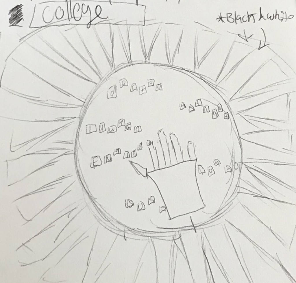
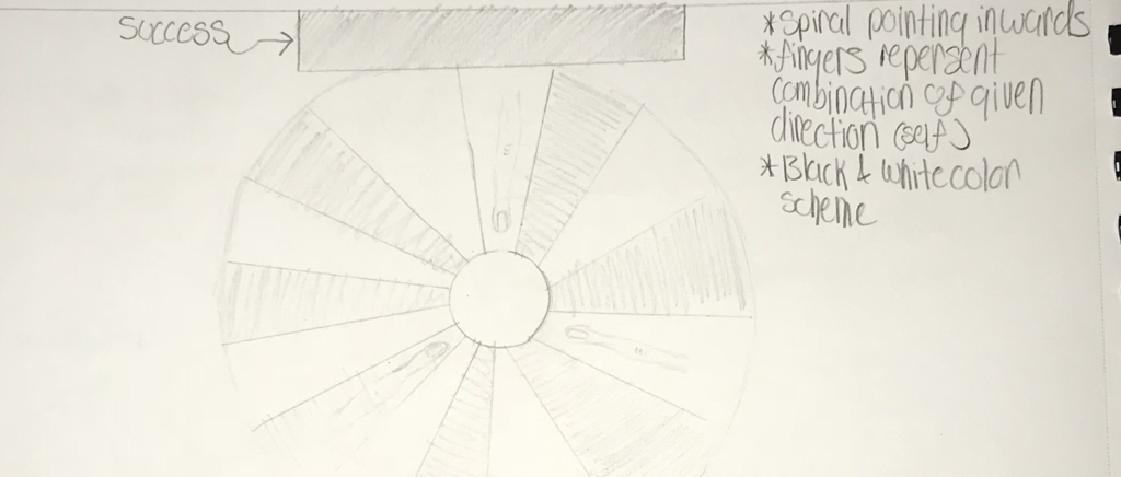
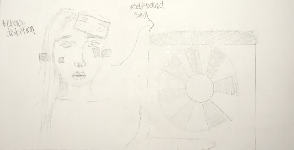
To the left is a written description on the process in creative ideas for the artwork. The top half of the page also served as brainstorming my ideas. This can be seen in the initial similarities to the planning sketches. There is also a brief concept on the inspiration used. As written to the left, Barbara Kruger served as a source of inspiration. In comparison my artwork and the inspiration have an alike spiral design. The optical illusion serves as a representation for forced upon ideas which compares to Kruger's work. This is the use of similar style with both pieces. Though in contrast as described within the writing, there is a difference in the artworks values.
|
Experimentation
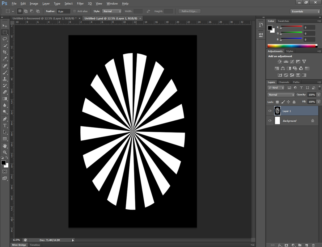
This was the initial spiral design created. This is an inverse of colors, from the currently used circle in my artwork. The outer circle is also smaller and does not reach the edges. Trial and errors of experimentation was used multiple times in order to create the spiral. This was necessary in order for the spiral portions to fit the image.
|
Next there was an experimentation on the number and placement of the pointer finger. Initially the fingers where going to be placed all throughout the spiral. Though while doing this the circle became quite clustered. It also became troublesome when the fingers abruptly cut outside of the spiral. This was then later changed to an fewer and even fingers.
A test of color change was also done in order to fit a monochrome color scheme. Though this was not done as it did not fit the already set style. Lastly a big cut and fill of the face was going to be done. Though this proved to be time consuming. It also did not fit the central idea of the piece being scattered. |
Reflection:
My artwork does reflect some elements of my inspiration. As previously stated there is a comparison of similar style to Kruger's piece. Though there is a contrast in the medium used for the artwork due to time period. My art also focuses on the concept of success and its one idea forced upon young adults. It also express my personal unknown on my future through a scramble. This concept for my artwork has been reflected on along the way and condensed into my current artwork. A form of this is the use the optical illusion to allude to the concept of direction.
There were success and failure throughout completing the artwork. Things that went well through the Photoshop process was cutting photos. As I had a basic knowledge of this it made the process smooth and clear. Though if I had more skill in Photoshop I would like to make the sign pop less out from it background. In the future if this project were to be done again, effort would have been placed on additions to the sign. An emphasis was still placed on the sign, though as initially desired. A challenge that arose initially was creating objects within Photoshop. This was time consuming due to the fact my knowledge did not exceed manipulating photography. Though throughout completing my artwork, I gained more of an understanding on proportions and how it affects elements within Photoshop.
There were success and failure throughout completing the artwork. Things that went well through the Photoshop process was cutting photos. As I had a basic knowledge of this it made the process smooth and clear. Though if I had more skill in Photoshop I would like to make the sign pop less out from it background. In the future if this project were to be done again, effort would have been placed on additions to the sign. An emphasis was still placed on the sign, though as initially desired. A challenge that arose initially was creating objects within Photoshop. This was time consuming due to the fact my knowledge did not exceed manipulating photography. Though throughout completing my artwork, I gained more of an understanding on proportions and how it affects elements within Photoshop.
Act:
Clearly explain how you are able to identify the cause effect relationship between your inspiration and its effect on your artwork?
-The inspiration used hold a cause and effect relationship between my artwork. For instance in "Repeat after me" by Barbara Kruger, the use of a spiral effected my use of this design to represent the leading direction. Even in "Portrait V"(cause) the appearance of a distorted face, effected my decision within the artwork for a scramble to represent confusion, rushed and fear.
What is the overall approach the author has regarding the topic of your inspiration?
-The main source of inspiration for the artwork was "Repeat after me" by Barbara Kruger. The intent of the piece is a feminist basis on the ideas forced upon women. This is done through the spiral as an optical illusion of forced upon concepts by society.
What kind of generalization and conclusions have you discovered about people, ideas, culture, ect. while you researched your inspiration?
-Throughout my research I discovered as these concepts overlap in ones struggle with the presented ideas upon people. For instance in Kruger's artwork there is a consistent generalization of her work being feminist. This is in which she fights back at the ideas and concepts forced upon women through society norms.
What is the central idea or theme around your inspirational research?
-The central idea of my research was forced upon ideas by societal norms, This effected my research in initial beginning with artist such as Kruger. Though I am aware the specific values are not alike, they do overlap in concept.
What kind of inferences did you make while reading your research?
-For both pieces of inspiration exact synopses whee not given, which lead to some inference having to be made through context. For instance through context of Kruger's piece, i could infer that the piece was feminist. Though my research did lead to stronger grasps on ideals and values of the artists.
Bibliography
Kampanis, Iasonas. "Information." Iasonas Kampanis, 2015, https://www.iasonaskampanis.com/information/.
Kampanis, Iasonas. “Photographic: Portraiture: Portrait V.” Iasonas Kampanis, Iasonas Kampanis, 2014, www.iasonaskampanis.com/portraiture/.
Zine, Lilith E. “Barbara Kruger - Feminist Artist - The Art History Archive.” Prehistoric Art & Ancient Art - The Art History Archive, Lilith Gallery , www.arthistoryarchive.com/arthistory/feminist/Barbara-Kruger.html.
