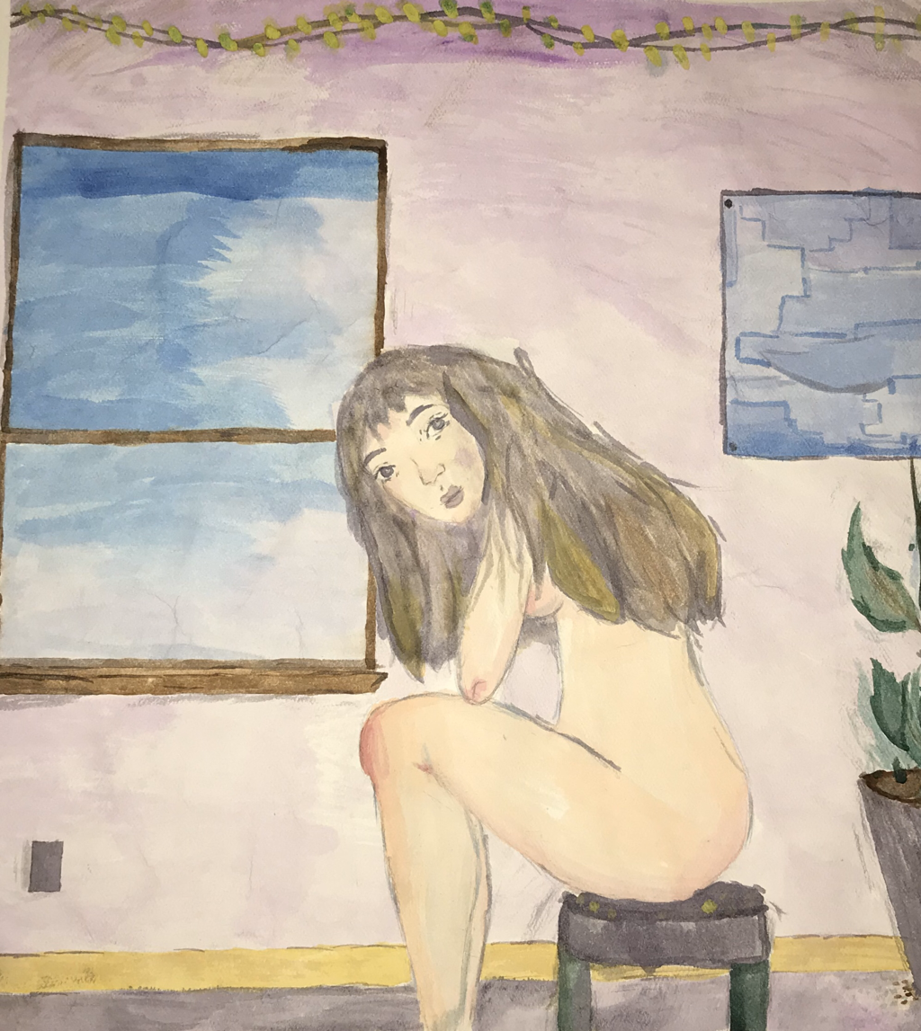
Artwork: Illustration
|
Title: Untitled
|
Exhibition Text:
"Untitled" presents ones reality through their surroundings. This piece uses form and color to highlight various aspects in ones life, despite their initial simplicity. As ones role and stance within society can be seen by their style and backgrounds. Overall this piece uses calm and soft tones in order to present ones being. Sources of inspiration for this piece include Guy Pène du Bois, "Yvonne in Pink Dress" and Gil Elvgren's, "The Wrong Nail". This piece does not manipulate external works.
Inspiration/Critical Investigation:
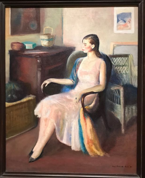
Pène du Bois, Guy. Yvonne in Pink Dress. 1931. Oil on Canvas. |
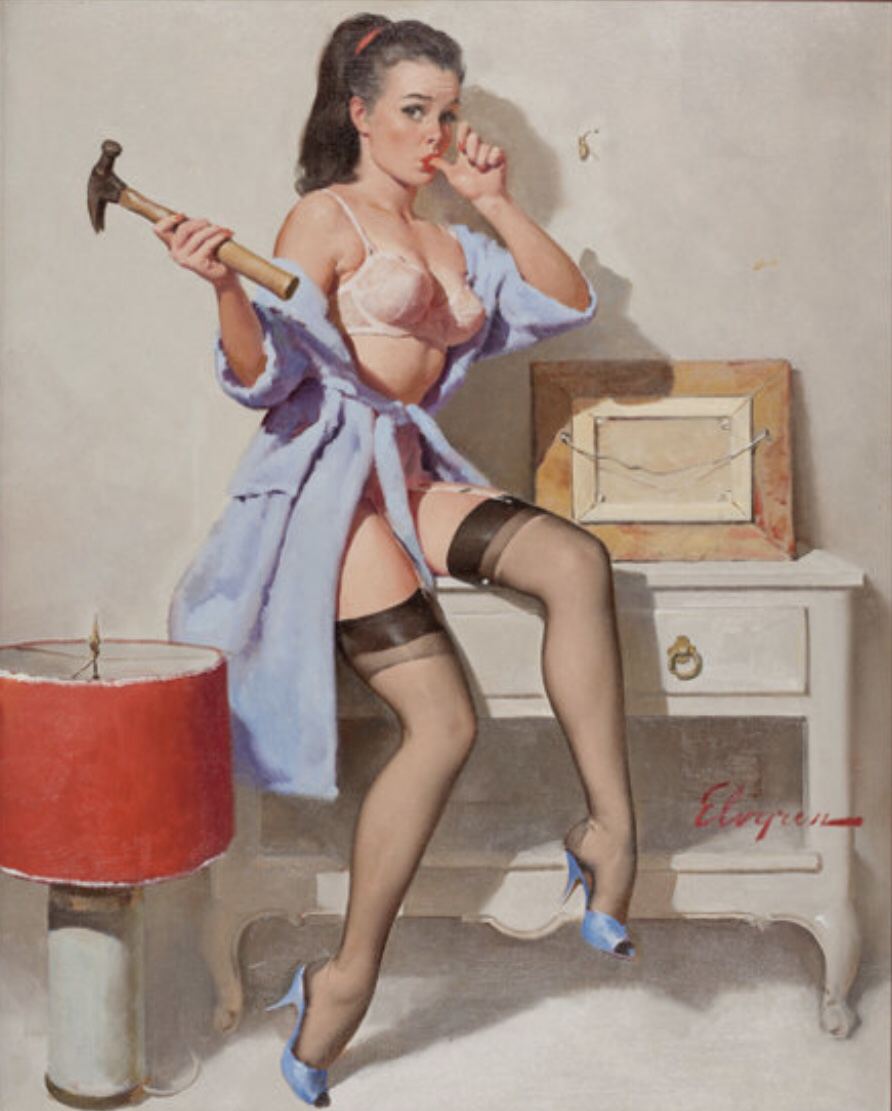
Elvgren, Gil. The Wrong Nail. 1967. Oil on canvas. |
A source of inspiration for my art work was Guy Pène du Bois "Yvonne in Pink Dress". This was an oil painting created 1931, that focuses on Yvonne and her surroundings within a room. The artist was born in america, though is inspired and holds an admiration for his french culture. His artwork can be described as observing social classes, while this particular piece holds a higher regard. The artist also presented the fashion and culture that surrounded him. This can be particularly seen by the clothing and background objects of this piece. This piece has minimal movement and seems as a rest. The subject also holds a gaze towards the left of the piece, while still holding minimal expression. The background consists of browns and beige's, whilst the subject is a light pink. Overall this piece holds a quite tone in both subject, color and surrounding.
Another source of inspiration for the piece was Gil Elvgren's "The Wrong Nail". This was also an oil pairing though it was created in 1967. This artist was american born and also inspired by american culture, which can be seen within his works. His works consisted of advertisements and illustrations. In particular his subjects were known as pin up girls that were within the realm of being american illustration. He is also known for his work within Brown and Bigelow, which consisted of oil paintings that were 30 by 24 inches, in which the piece of inspiration follows. This piece emits an emotion that is loose and upbeat, despite the actions depicted in the painting. This can be seen by the bright colors, smooth painting and facial expressions. This also holds movement as the subject just harmed her finger. The subject is also more involved with the viewer as the gaze is to the front of the piece. This pace also presents american culture through the background, style and clothing. "The Wrong Nail" is an upbeat piece that presents american culture through the pin up style.
Another source of inspiration for the piece was Gil Elvgren's "The Wrong Nail". This was also an oil pairing though it was created in 1967. This artist was american born and also inspired by american culture, which can be seen within his works. His works consisted of advertisements and illustrations. In particular his subjects were known as pin up girls that were within the realm of being american illustration. He is also known for his work within Brown and Bigelow, which consisted of oil paintings that were 30 by 24 inches, in which the piece of inspiration follows. This piece emits an emotion that is loose and upbeat, despite the actions depicted in the painting. This can be seen by the bright colors, smooth painting and facial expressions. This also holds movement as the subject just harmed her finger. The subject is also more involved with the viewer as the gaze is to the front of the piece. This pace also presents american culture through the background, style and clothing. "The Wrong Nail" is an upbeat piece that presents american culture through the pin up style.
Planning:
|
|
|
Process/Techniques/Experimentation:
Process
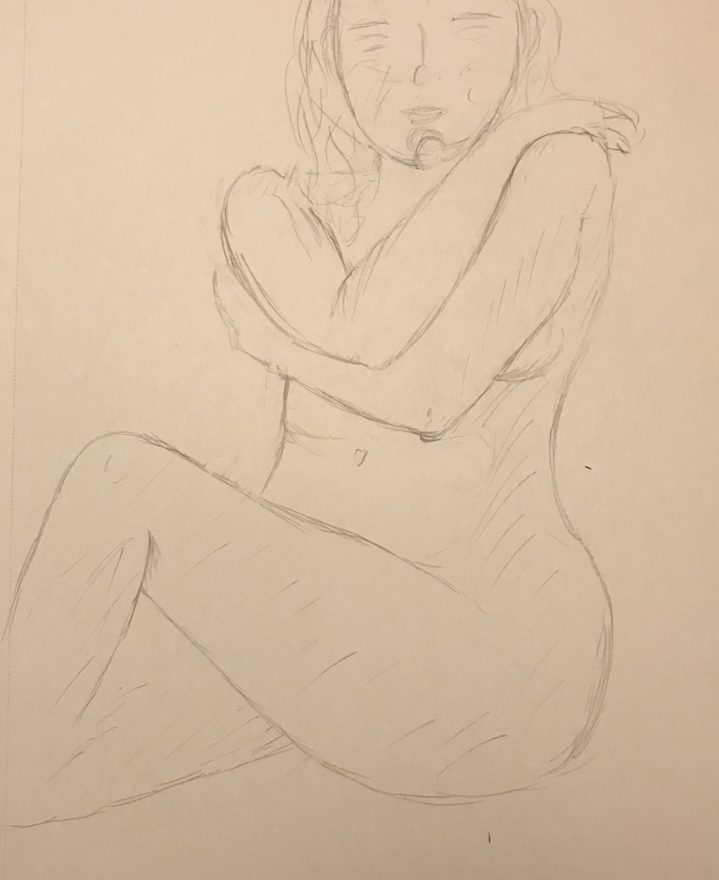
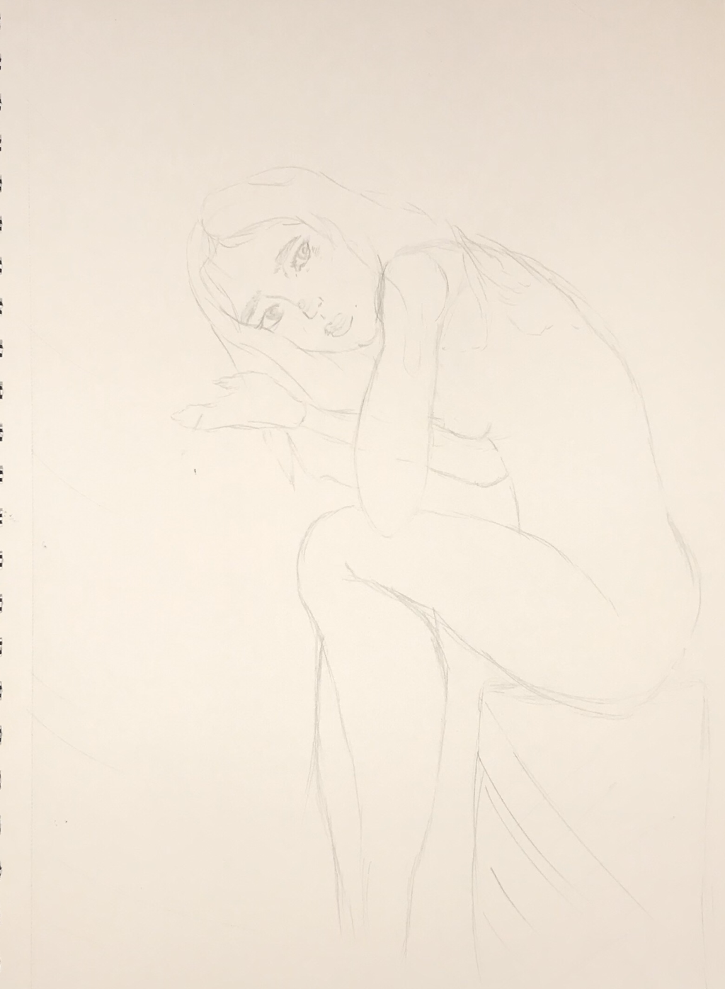
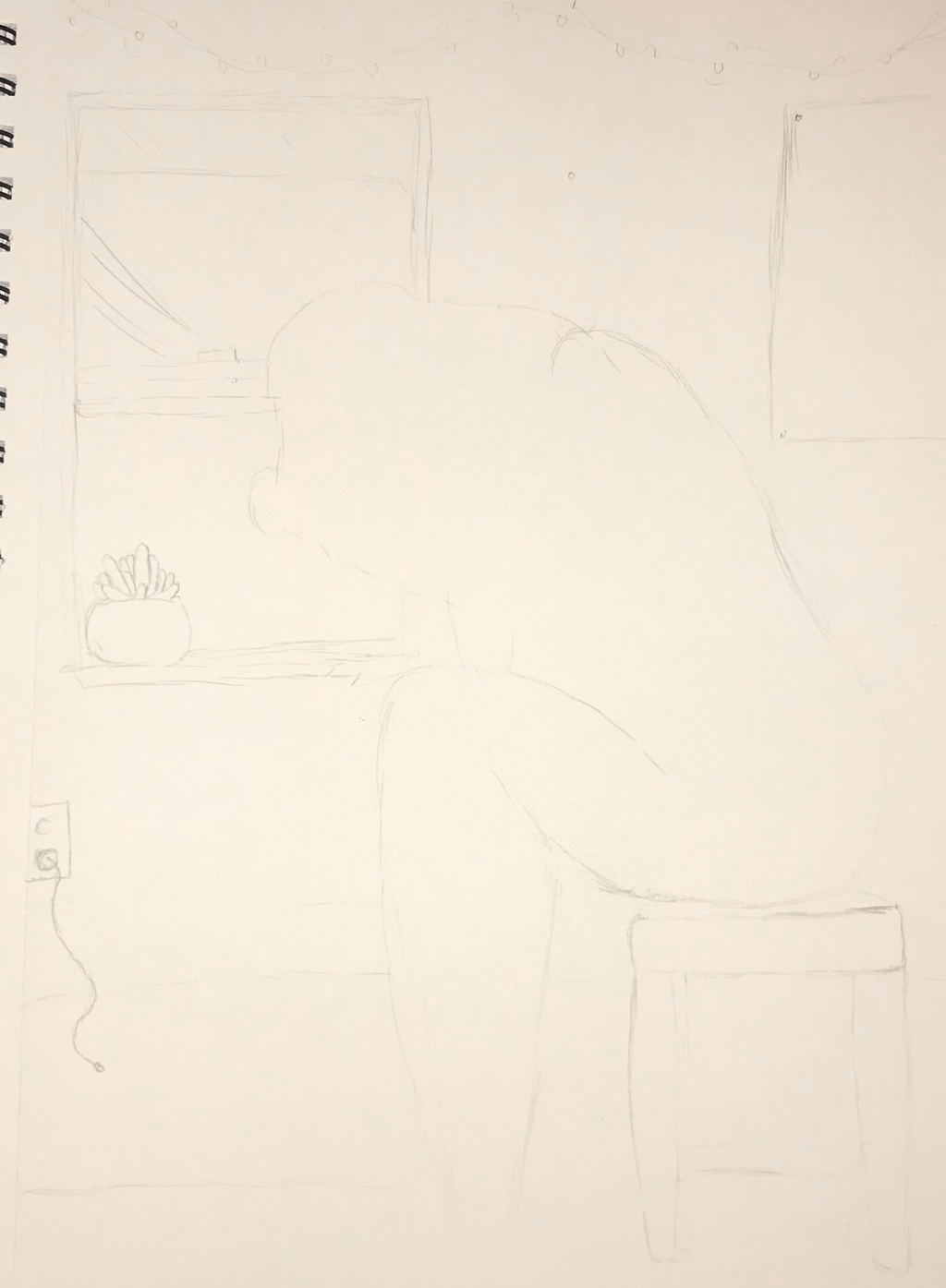
This work required multiple steps before achieving the completed product. An initial step that I took was to cut the paper. I used a full sheet of watercolor paper and then cut it in half. This was done in a landscape position, that is reflective of my inspiration. Then I began sketching the outline of the work, This was done with a lead pencil and outlined the forms of the work. I also used a ruler when sketching in order to divide sections of the work. This includes the floor, sides and window as sections of division. After I completed the sketch I then processed to attempt to stretch the water color paper. This was done through soaking the entire paper in water, and then allowed to dry. This was done in order to better combat the effects that water has on the paper. Thus soaking the paper allowed for an even amount of water on the entire paper. Once this was allowed to dry then I began to use the water colors. First I used tape, in order to outline the objects and keep a border for the work. This was helpful in separating sections. Especially since with watercolors you are not able to over work areas in color. I began to do washes and started with the background color. I attempted to create a vary of color through the background whilst using the same color. I was able to achieve this variation through the using various amounts of water and creating different shades. Before I used the colors I also tested swatches on a different paper. This can be seen with the brushes and paints used in the images above. I then began to paint the objects within the room after. I used this same process when painting other areas of work. The various paint colors and there water ratio can also be seen within the images above. Through this piece I worked on developing my skills and use of water colors in order to build depth.
Techniques
A technique that I used when creating the piece was to soak the water color paper in water prior to using watercolors on the piece. This particular technique was done prior to painting in order to create and even set paper. If this was not done then the water colors would set differently in areas due to different levels of water. Soaking the paper allowed for the entirety of the paper to be wet rather than particular areas. I soaked the water color paper in hopes to create a more even and flat piece. If this was not done then the paper would have been wrinkled in areas. Another technique I used when doing this piece was using tape in order to create solid lines within the piece to serve as a better guide. I also used the tape to set the piece onto the board and keep it flat,despite the watercolors pulling it. Overall these techniques focused on working with the watercolors and avoiding wrinkles in the piece.
Reflections/ Critique |
Compare & Contrast (evaluations) |
|
Throughout the process there were actions taken that could have been done more efficiently. This is particularly present within the hair of the center model. As the water colors could have been used better within a mixture. I should have focused on the wash rather than the form initially. Instead when using the watercolors, I focused on the form first. This lead to harsh lines and movement present within the hair. This contradicts for the soft tones achieved in the piece. If I were to use watercolors to paint hair again, I would use the paint more carefully. Another critique would be better care and type of watercolor paper used. As despite attempting to stretch the paper, there was still a presenace if wrinkles and water sinking in. This was a particular issue for the sink of water, as I could have used the colors more effectively. I also could have given more gap time to dry. Overall these critiques will help me in future watercolor works.
|
Pène du Bois, Guy's, Yvonne in Pink Dress served as a source of inspiration for the piece made. This artist focuses on presenting society through people and their surroundings. This serves as an initial similarity between the pieces, in theme. Another similarity is in the center object of the piece being a female within a relaxed position. While the background is also within a room and includes various objects that is reflective of the works overall tone. Though my own piece differentiates in style and in medium. As the inspiration used oil paints which achieves a different style for the particular piece. The inspiration achieve a soft yet detailed and realistic style. As the piece does not hold many harsh lines, and even the model's line are soft.
Elvgren's, The wrong nail also served as a source of inspiration for the piece made. This art focuses on presenting a playful tone to reality. This is done in both form and style of the piece. Similarities between the inspiration and my piece are within the use of a female model, as the center focus. Another similarity is the use of background objects. Though this piece uses the objects as a connection of action, which differs from my piece. The mediums used also differentiate as Elvgren used oil paints, which allowed him to achieve a high aspect of detail. This detail can be seen within the furniture and the center body of the piece. |
Ideas
|
|
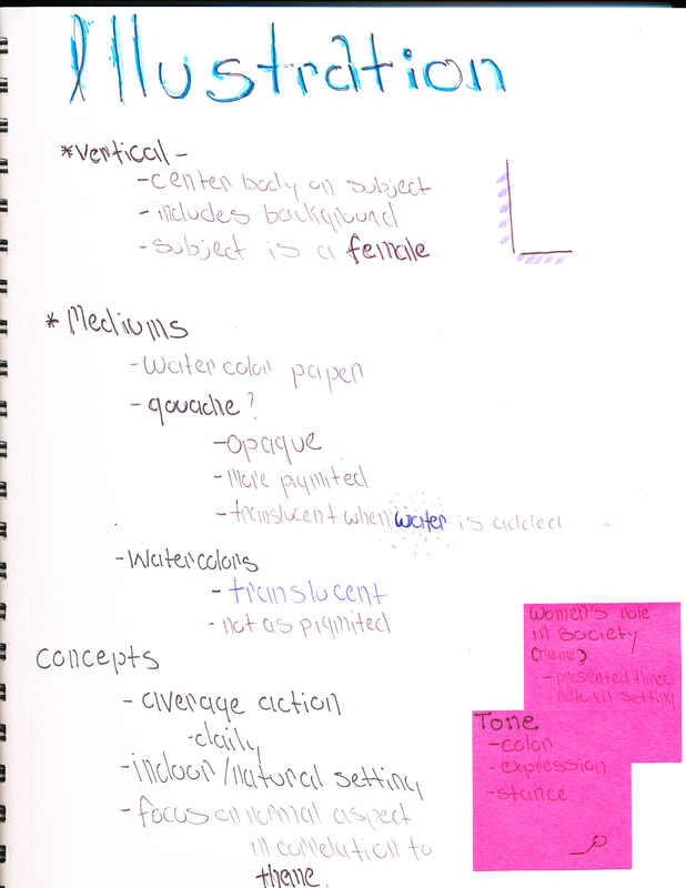
There is an outline present for the concept of the illustration to be made. This mainly focuses on the key concepts to follow and the medium options. As initial the base will be vertical in order to focus on the subject. There is also outline of the type of mediums to be used when making the piece. As both have different pros and uses. The gouache will proved a more opaque style. While the watercolors will be more transparent. There is also an outline for the theme and concepts to be used. As I am aiming to present a natural setting that holds a strong tone towards the theme.
There is an outline present of the artistic inspirations used for this project. Overall this highlights the similarities and contrast between the artist. This also highlights the key components of each artist works and there inspirations/ values. This also provides a general background on each artist. As Pene du Bois is inspired by french culture and observes society. While Elvgren was an american artist who's work focused on pin up girls, which held a playful tone. |
Experimentation
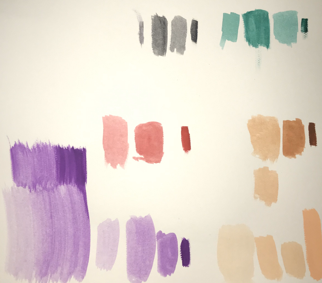
As experimentation for this project I tested the colors to be used for the piece. In particular this was swatches for the water colors used. Various colors were tested on different level of pig mates and water saturation. This can be seen done above with various colors. The colors I did swatches for were viridian hue,purple, ivory black, burnt umber and jaune brilliant. The initial swatches where done with the pure color from the set. While the rest includes various level of water added. I wanted to see the levels of color that one color could hold depending on the ratio of water added. As opposed to other paints, watercolors were able to go down a shade when a higher ratio of water was added. While the color would be darker and more pigmented when no water was added. Through this I also saw how the watercolors applied to the surface to be used for the piece. This surface was watercolor paper that was not yet soaked.
I also slightly experimented with doing washes with the color purple during these swatches. I focused on building a progression through the different shades, and found that moving the paint through made an even tone. Through this I also found it best to keep a consistent tone ratio of pigment. This allowed for less harsh lines to be present within the wash. I learned this by using diffrent ratios of colors in this practice wash. |
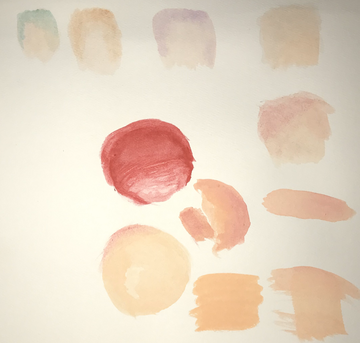
I also experimented on the skin tone to be used for the piece and it relation with other colors. In particular I used the same set color at different levels to find the right pigment. Higher and lower ratios of water can be seen within these swatches. Through this I also wanted to see how the skin tone would blend and progress with different colors. In particular I focused on the relation between the color red as an undertone for the skin. Through this experimentation I found that a even ratio of water with the skin tone mixed well with a low pigment red that bleeds onto the skin. This mixture created a more even tone skin that didn't have any apparent harsh lines. Through this experimentation I found a ratio that I liked for the skin tone.
I also experimented with the skins tones relation with other colors at a low pigmentation. I mainly focused on how the color would blend onto the skin tone and how fast. In particular I found these water colors dried faster with a lower pigmentation present. Thus when blending between two different colors a harsher line was left rather than a smooth mixture/overlap. the particular colors used for this experimentation where viridian hue,purple,ivory black and burnt umber. |
Reflection:
There was both success and errors that occurred when creating and preparing for this piece. Errors did occur in some areas of the work when using the water colors. This was present when overworking and area in color. I was not use to working with water colors and thus it’s limits. As with other paints, I was able to work and blend the colors with time. While the water colors form set initall depending on the amount and flow of the color. This even given the work form and lines, just through the flow of color. I will take this timing into future water color works done. There was also a change I would make to the use of objects and background of the piece. As I felt the final piece was flat, and a more dimension would help the pice. This would bring more attention to the wanted background and allow for a more Intriguing piece.
When doing the background objects, I found I had the mosey successes using the watercolor. I feel that I was able to successfully present various shades of one color on an object. This allowed me to provide form into the objects through the depths of shawdows. I also appreciated how the washes of paint, did not form harsh lines. They mixed evenly between eachother and when able to blend despite the color difference. I was hoping for this occur, to bring more depth into the work. I also found success in keeping forms separate from each other. This was done through using tape, while allowed me to avoid the water colors bleeding into unessary areas. Overall theses success and failures while doing this work, gave me more knowledge on watercolors and how they work.
When doing the background objects, I found I had the mosey successes using the watercolor. I feel that I was able to successfully present various shades of one color on an object. This allowed me to provide form into the objects through the depths of shawdows. I also appreciated how the washes of paint, did not form harsh lines. They mixed evenly between eachother and when able to blend despite the color difference. I was hoping for this occur, to bring more depth into the work. I also found success in keeping forms separate from each other. This was done through using tape, while allowed me to avoid the water colors bleeding into unessary areas. Overall theses success and failures while doing this work, gave me more knowledge on watercolors and how they work.
ACT:
Clearly explain how you are able to identify the cause effect relationship between your inspiration and its effect on your artwork?
-The inspiration for the piece impacted it through style and theme. As it focuses on observing women within a natural setting, from a outlook on society.
What is the overall approach the author has regarding the topic of your inspiration?
-Pène du Bois focuses on presenting a natural setting and a relaxed model that is not exaggerated, though an expression of reality. This also brings along the current expression of there position with society. While Elvgren aims to express and exaggerated and appealing image of women.
What kind of generalization and conclusions have you discovered about people, ideas, culture, ect. while you researched your inspiration?
-I concluded that there are various ways that women are presented within society through arts presentation of them in both setting and nature. This can be done through the mood of a piece without over exaggerating a solid meaning.
What is the central idea or theme around your inspirational research?
-The theme around my inspirational research was on women role within society. This was particularly presented within a natural setting that did not aim for big message.
What kind of inferences did you make while reading your research?
-When researching I made inferences of the particular tones presented from the pieces. I came to these conclusions be observing the individual pieces and there backgrounds.
Bibliography
Martignette, Charles G. “The Art & Life of Gil Elvgren.” Gil Elvgren - About, www.gilelvgren.com/GE/bio.php.
Torchia, Robert. “National Gallery of Art.” Artist Info, 17 Aug. 2018, www.nga.gov/collection/artist-info.1248.html.
“Yvonne in Pink Dress: Milwaukee Art Museum.” Yvonne in Pink Dress | Milwaukee Art Museum, collection.mam.org/details.php?id=9831.
Torchia, Robert. “National Gallery of Art.” Artist Info, 17 Aug. 2018, www.nga.gov/collection/artist-info.1248.html.
“Yvonne in Pink Dress: Milwaukee Art Museum.” Yvonne in Pink Dress | Milwaukee Art Museum, collection.mam.org/details.php?id=9831.
