Artwork:
|
|
Title: The Luminary
Size: 3 ft by 3 ft
Medium: Mixed Media
Completion: 2018, November
Exhibition Text:
“The Luminary” is a critique on my international communities magnetism towards technology. As within my community technology dependence has grown to the point of an addiction which is at the center of daily lives. Inspiration for the piece came from Juan Gris and Laura Owens. The focus of a technology device within both pieces is used to highlight a “need” from my community, while the people gravitate towards. Aspects within the first piece were created in photoshop, while the second is draw.
Inspiration/Critical Investigation:
Gris, Juan. Guitar and Fruit Bowl on a Table. 1918. Oil on Canvas. |
Owens, Laura. Untitled. 2018. Screen printing ink on paper. |
A source of Inspiration for both artworks is Juan Gris “Guitar and Fruit Bowl on a Table”. The artist made the piece in 1918 during the cubism art movement. Cubism focused on geometric shapes, single perspectives and overlapping forms. This particular artwork focuses on cubism elements. It is simple with form, such as the person near the table. While the guitar has overlapping elements within itself. Gris portrays the guitar in multiple tones and overlapping forms. The artwork also has a tone of colors. The colors used are yellows, white, grays and black. The culture that surrounded Gris at the time can also be seen within the painting. As forms of entertainment came from playing the guitar or reading. The aura of the culture that surrounded the artist in this particular work is focused on daily objects. This transfer into the inspiration for my artwork. As simple forms are used, especially within the first piece. This can be seen through how the people are portrayed. The mediums used to form the people contrast, as mine were made using Photoshop. The use of contrasting colors within the background is also present within the first piece. As for the culture that surround one, the meaning is transcend in order to be relevant today in my piece. Both focus on technology as the daily objects that surrounds. In general, the use of simple forms used by Gris served as inspiration for both artworks made.
Laura Owens “Untitled” made in 2018, served as a source of inspiration. The medium in which the artwork is made is with screen printing ink on paper. This allowed the work to have translucent, while also obtaining solid colors. This is primarily present through the overlapping of light pastels on the white forms. Owens piece also focuses on overlapping forms. As the basis is very dark, while the colors become light within the upper layers. This focus of overlapping colors and forms by Owens, served as inspiration for my artworks. Though the mediums used do contrast, as my artwork uses silkscreen. As the silkscreen will be used to overlap the forms. The soft forms used by Owens also served as inspiration. This is primarily due to both pieces focusing on basic forms. Lastly the style of color used was also inspiring. As Owens has solid yet translucent colors. This use of color is primarily present within the second artwork created. Overall the forms and color style used by Owens served as inspiration for both pieces.
Laura Owens “Untitled” made in 2018, served as a source of inspiration. The medium in which the artwork is made is with screen printing ink on paper. This allowed the work to have translucent, while also obtaining solid colors. This is primarily present through the overlapping of light pastels on the white forms. Owens piece also focuses on overlapping forms. As the basis is very dark, while the colors become light within the upper layers. This focus of overlapping colors and forms by Owens, served as inspiration for my artworks. Though the mediums used do contrast, as my artwork uses silkscreen. As the silkscreen will be used to overlap the forms. The soft forms used by Owens also served as inspiration. This is primarily due to both pieces focusing on basic forms. Lastly the style of color used was also inspiring. As Owens has solid yet translucent colors. This use of color is primarily present within the second artwork created. Overall the forms and color style used by Owens served as inspiration for both pieces.
Planning
|
|
|
|
Process/Techniques/ Experimentation
Process
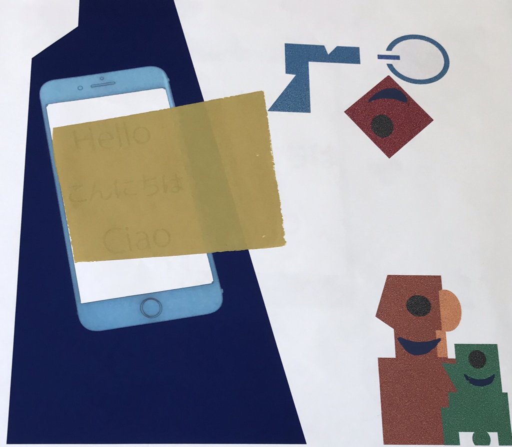
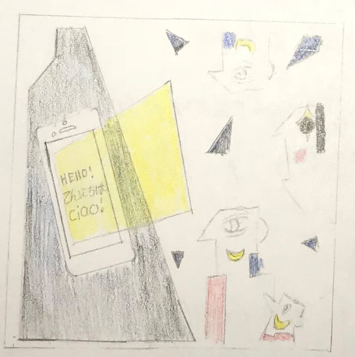
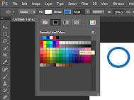
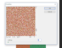
This piece consist of two mediums, which is digital manipulation and silk screening. The background of the piece was made within Photoshop. This was done on a 36” by 36”, with a resolution of 200. To begin the background was set to white, which was done in order to avoid a clustered background. Then basic forms were created within Photoshop as a base. Within the first image a faint outline can be seen. This is the border placed for the forms and images, which was created with guide from the ruler tool. Next multiple figures of shapes were overlapped in order to create the specified form of the dark blue figure. This was done using the shape tool which consts of figures such as rectangles. After the people to the right were formed very similarly to the figure to the right. As the forms within the piece are not already set within Photoshop, I had to overlap figures in order to create the wanted form. Consistent colors were used for each person in order to avoid the appearance of overlapping forms. For instance the arm to the up-center was created through rectangles overlapping with white. As the edge of white triangles where used in order to create clips within the arm. Overall some of the figures used to create the people can be seen in the right column within the second image in Photoshop. Within the fourth image the forms are being pointillized, which was selected through the filter tab. The cell size was also left small in order to have a larger amount of cells present. This was the last aspect in building the basic forms of the background.
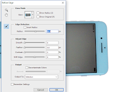
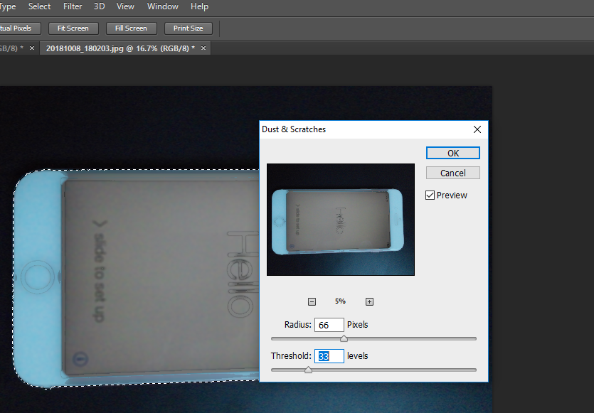
Next the phone used within the digital portion of the piece was the manipulation of a photograph. First the object was selected using the quick select tool with Photoshop. This was made easier due to the photograph having a darker background than that of the object. After refine edge was used in order smooth the selected area, and only take the phone out of the photograph. After the was done the object was still left selected in order to manipulate the original image. First the blur tool was used in order to further smooth the object. Next the dust and scratches was used through the filters tab. While doing this it was done a set amount in order to further whiten the phone and simplify the figure. These were done in order to have it fit within the digital aspects already placed on the background. As the shaped figures are simplistic and solid forms. Lastly the phone was transferred onto the background and shaped in order to properly scale to it. When on the background the center of the phone was hallowed in order to make the screen white. The screen was filled with white figures in order to again simplify the phones appearance. The white set was put behind the phone though in front of the blue figure background. Next the text was added to the screen within Photoshop using the text tool within Photoshop. It was set larger enough to be be seen while being able to fit within the phone. For instance the same large font size is used for both hello and ciao, though こんにちは is at a smaller size. The text was also centered and spaced on the phone in order to appear more even. This was done through guide from the ruler tool. Lastly for the digital background the colors were tinted lighter and the guide border line was removed. The final piece within Photoshop was printed on tyvek on a a 3 ft by ft.
During silk screening three different stencils were used and two different color. In order to create a stencil freezer paper was used and sketched on. A ruler was used when sketching the forms in order to have the correct proportions. Then they were cut out in order for the stencils figure to be used. The colors used while silk screening were beige/yellow and a blue. The stencil was then taped to the edges of the board used facing up. Next the paint is then placed above the stencil, on the silkscreen. Using a plastic squeegee it is then pulled down bellow the stencil. This is done in order to cover the entire stencil and have the paint go through onto the background. It is then lifted and the stencil is removed, when fished using. When switching colors the entire silk screen board was cleaned. This was done twice for the specific piece when colors where changed. When fished the piece was put onto the drying rack in order to let it dry. This can be seen in the eighth image. The silk screening process was the last aspect of the piece.
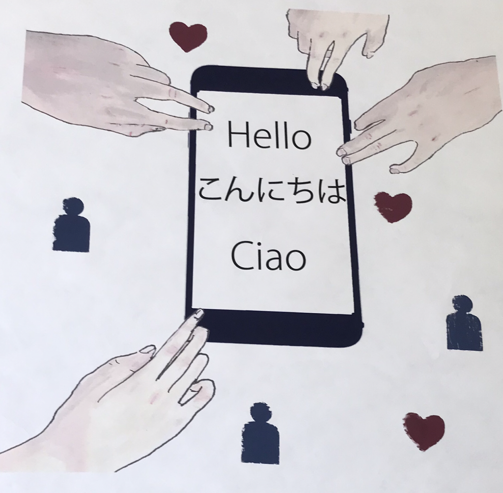
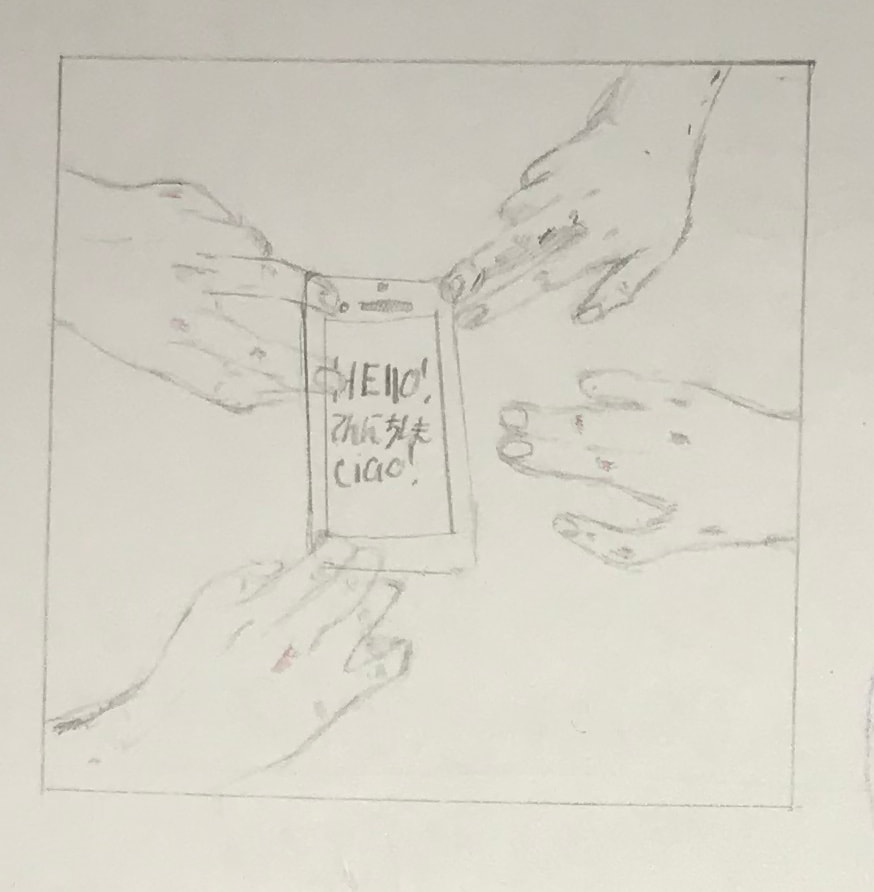
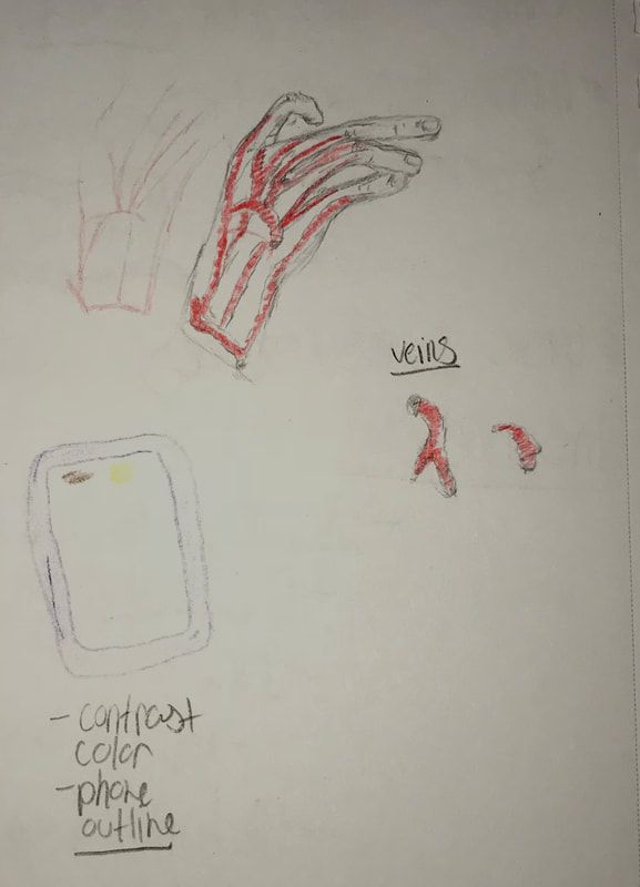
This mixed media piece consist of a painting as the background and silk screening. The painting aspect was created on a white square as seen in the first image. Then the forms to be painted where sketched on the base, in order to serve as a guide. This includes the hands, phone, text and boarder drawn in pencil. Next to make the skin tones for the hands colors are mixed. This includes red,blue,yellow and white, which are the primary colors. A different amount of each color is added in order to create different skin tones for each hand. The different shades and mixes of colors can be seen within the second image. For instance in order to create highlights for a particular hand the base colored used is lighted with white. Within the fourth mage swatches of the skin tones used are shown. The brushes used are #3, #4, and a #5 flat brush. Another brush used were a #3 round brush. After the painting aspect was complete a fine point sharpie was used t outline the figures. A scan of the painting was then taken in order to transfer it digitally.
Within in Photoshop the painting was refined in order to fit on a 36" by 36" with 200 resolution. The scan taken of the painting is smaller than the size needed, so it had to be scaled properly in order to avoid distortion and keep a clean image. The hands were selected using the quick select tool. Then refine edge was then late used in order to keep the edges clean. The use of a white background for the painting, allowed for any crevices between figures to blend. Then they were placed on a white base with a white border in Photoshop. The process of the boarder is similar to hat of the last piece, which is guided by rulers. Next the phone outline used within the last piece was transferred into this file. Though the color was changed using a color filter within Photoshop. The phone was also rotated and set straight within the center of the piece. A final check for the piece done suing the view and actual size drop down. This was used in order to look close and clean up an errors on the piece. The final piece within Photoshop was printed on tyvek on a a 3 ft by ft.
Lastly silk screening was done on addition to the background of the piece. For this particular piece two stencils where used, which are a heart and figure. The stencils were sketched on freezer paper then cut. The stencil was then taped to the silkscreen board. Then it was placed on top of the background within the wanted location facing upwards. The colors used where red and blue for the paints. This was added to the board and then pulled down using a plastic squeegee. They were acrylic based which allowed for the paint to dry quickly. When colors where changed the stencil was removed and the board was cleaned. As two different colors where used, this process had to be done twice. Once finished the tyvek was placed on the drying rack in order to let the paint dry. The silk screening was the final aspect of this piece.
Techniques
|
|
|
|
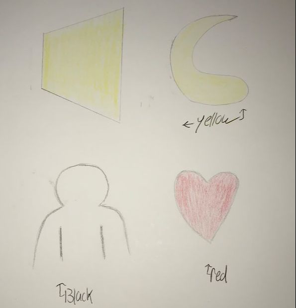
My skills were strengthened through the various digital aspects of these pieces. During this process I experimented and used tools that I have not previously used. For instance for my piece first piece I focused on creating forms within Photoshop. As the first two images show techniques and tools used in order to form the people. For instance when creating a hollow circle, it was filled white then its outline was thickened and colored. This technique was consistently used when creating forms within Photoshop in order to create simplistic forms. Pointalize was also used for all the forms of people. This was done to a small cell, in order to represent a large number of people in relation. The same techniques for the phone were used in both pieces. As the phone was always refined and simplified in order to fit the focus of both pieces. Though this skill was strengthened through experimentation of ways to simplify the object.
Reflection/ Critique |
Evaluations |
|
In reflection to the process above used, changes could be made for the future. For instance more experimentation with a variety of skin colors could have been done. In the future more base colors would be used and swathed. This would be done when mixing the primary colors and white proportionally for separate tones. Though I did focus more on a trial process for the four wanted skin tones in the painting. As a critique, a better base should be set for each color in order to have a larger variety.
When creating stencil, more time could have been used in order to make them clean. As a ruler was used for measurement, though a precise outline wasn't. A critique for the future would be to use an outline. For instance the form to be used may have been printed and then sketched on the freezer paper. Overall more planning ahead could have been used to have precise and neat edges. |
Juan Gris's artwork served as an inspiration for my pieces done. This can be seen done through the convey of simplistic perspectives. It can also bee seen through the first background contrast between a darker and lighter tone. The dark and browns used are similar to that of Gris's. There is then a focus on objects which is then transferred through inspiration for my piece. Though his work is within the central focus of cubism in painting. This is done with geometric figures. Which also sets his piece to be flat convey of a three dimensional world. While in my artwork that aspect is still present, though through lighter tones. In evolution to my piece, there is more of a focus on human relation to technology rather than geometric forms.
Owens artwork also served as a source of inspiration for my artworks. This can be seen through the similar use of color. It is also seen through the overlapping of figures. The colors within both pieces transcends from dark to light. As tones of blue are similarly used for the set background surrounding the phone. While there is also overlapping of simple forms done in connection to the color used. As lighter shades such as yellow within the first piece overlap the phone. Though Owens conveys forms in a more organic fashion than that inspired from Gris geometric. Her organic forms are used in multiples around her artwork in transcending tones. While in contestant my piece is a simplistic representation of forms such as a phone,people and hands. Owens served as a base inspiration for the color and overlapping figures used within both pieces of artwork. |
Research
International Community Critique
Neil Warburton
Neil Warburton
- "Western...has its origins in conversation, in face-to-face discussions about reality," (Warburton 2013)
- "Audible non-verbal aspects of the interaction, such as hearing the smile in someone’s voice, a moment of impatience, a pause (of doubt perhaps?), or insight — these factors humanise..." (Warburton 2013)
- Technology has allowed for a global audience to be reached. It allows more people to come together on an international scale. Though this comes with a mechanical aspect being more prevalent within lives.
- "The contradictions cover such a range. The talk would talk and go so far aslant."
- Communication is vital to humans, and the way in which it is done has evolved. Communication allows for ideas to be challenged, which is done through talk.
Ideas
|
|
|
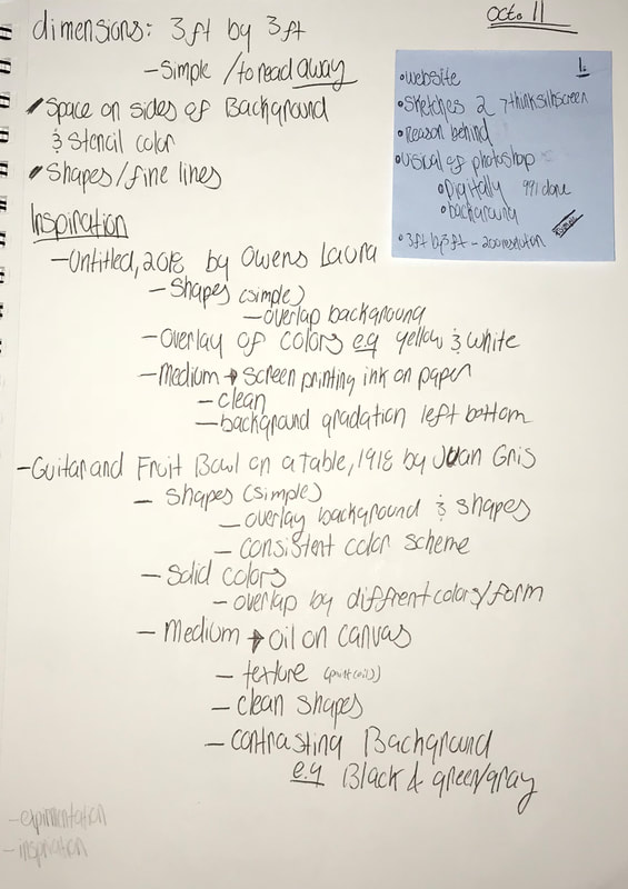
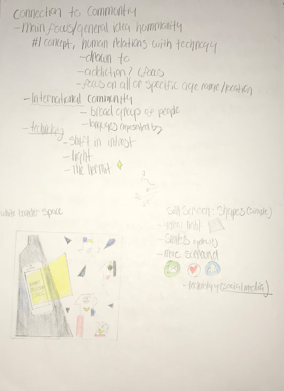
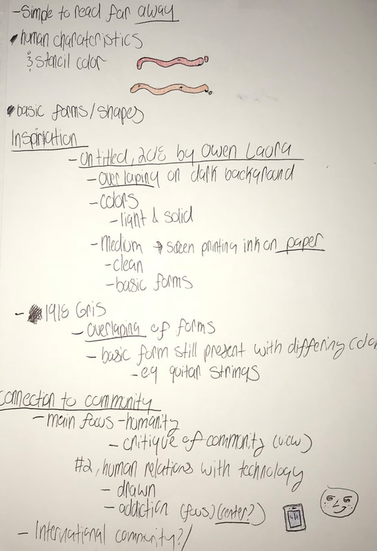
The image of brain storming focused on initial inspiration and guidelines for the art. The top sets regulations such as size and what is needed for it. While bottom summarizes the aspects of my inspiration in relation the the artwork. There is a consistent focus on shape,overlay,color and medium of the inspiration. The second image focuses on one particular piece. It relation to community is summarized through and international community. While the aspects impacting its relation to technology are drawn out to the right. A small sketch of stencil ideas is also present, in order to relate to community. While the third image is brainstorming for the second piece done. Again there is a focus on the inspiration in relation the the artwork to be done. There is also an outline for its relation to community in the bottom. While at the top there is ideas for stencils to be use din relation the idea of community. Overall there is a focus on inspiration, community and concepts.
Experimentation
|
|
|
|
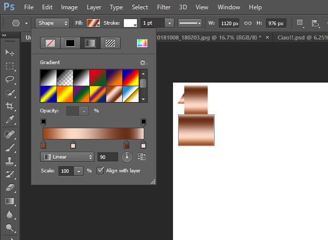
It was a process in order to find the right aspects needed to be changed for the phone. As the main goals was to simplify the phone i order for it to appear in place within both backgrounds. The image above can be seen to have a lot of blur and manipulation done. Even the dust and scratches filter was done excessively. This expermentation was done in order to see the levels in which the phone may be simplfied.
|
Initially when creating the forms of the people for the first piece,experimentation was done in order to figure out the right appearance. As in the image above, a gradient is used as a set tone for the form. It also sets a texture through smooth color. Though this was not used due to the overlapping of shapes to be overwhelmingly present. The use of a gradient dose not allow the shapes to overlap.
|
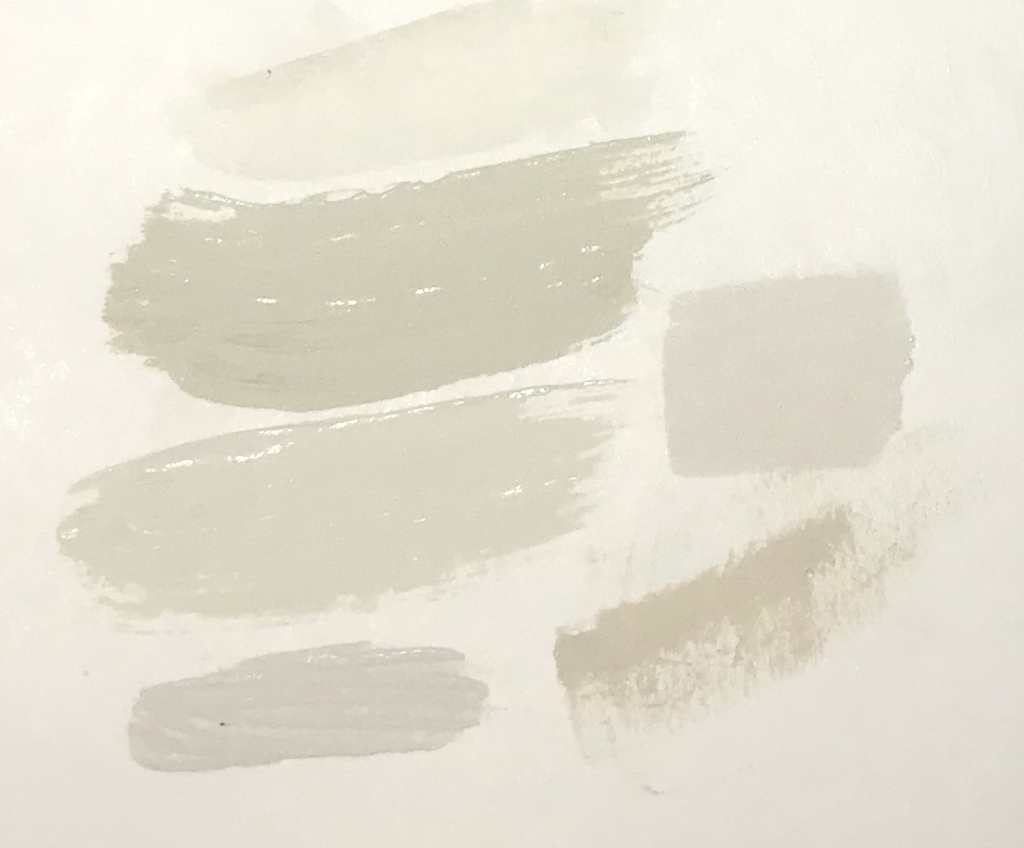
When painting the second piece there was experimentation done with tones. These where used for the skin color of hands. In the image above swatches of tested colors are shown. For instance when mixing skin tones different portions of red, blue,yellow and white where used. Some errors occurred when mixing colors,. For instance the second color swatch is green and pale, while I was aiming for skin color.
|
Reflection
Throughout the process of theses artworks, I have refined my skills and developed as an artist. Though errors were present throughout the process of completing theses artworks, reflection was done along the way. A success within the digital aspect of the mixed media pieces is present. As through trial and error my skills within Photoshop were refined. In relation to the process of the phone within both pieces, similar products were used. I feel that I was able to successful transfer, simplify and refine the phone in relation to both pieces. In addition there was a consistent pattern of geometric figures within the first piece. This was inspired by the cubism aspect of Gris's work, though in contrast was portrayed digitally. This process was refined within Photoshop through practice of using figures.
Errors also occurred throughout the process of creating the multimedia pieces. During the silk screening process error were made, as this was a my first time. The most present error is within the first piece, as initially planing was done incorrectly. The original idea for the piece contrasted from Owens overlapping of colors. The goal was for the yellow geometric figure to be silk screened and be transparent. This would allow for the phone text and light to co exist. Though through the process the silkscreen form left a solid figure rather than transparent. This cause the text to be faded away in comparison to the color placed upon. Though through this process I have learned for future silk screening to ensure a transparent color of plan for the background to be dominated. Overall through process and experimentation I was able to refine my skills and reflect on the artworks created.
Errors also occurred throughout the process of creating the multimedia pieces. During the silk screening process error were made, as this was a my first time. The most present error is within the first piece, as initially planing was done incorrectly. The original idea for the piece contrasted from Owens overlapping of colors. The goal was for the yellow geometric figure to be silk screened and be transparent. This would allow for the phone text and light to co exist. Though through the process the silkscreen form left a solid figure rather than transparent. This cause the text to be faded away in comparison to the color placed upon. Though through this process I have learned for future silk screening to ensure a transparent color of plan for the background to be dominated. Overall through process and experimentation I was able to refine my skills and reflect on the artworks created.
ACT
Clearly explain how you are able to identify the cause effect relationship between your inspiration and its effect on your artwork?
-The inspiration can be seen to have a cause effect relation on the pieces. Gris's cubism and the form in which he portrays people in "Guitar and Fruit bowl on a Table", effected the forms within my piece. Gris focus on objects also effected my use of a phone as a center object within both pieces.
What is the overall approach the author has regarding the topic of your inspiration?
-One of the sources on inspiration, Gris focuses on cubism elements for his piece. He approaches this through geometric shapes and perspective. Gris approach in painting reality was differing from ideal works at the time of ones perception.
What kind of generalization and conclusions have you discovered about people,ideas,culture,etc. while you researched your inspiration?
-Through my research of inspiration I discovered different forms in which ideas are convey through placement and simplified figures. As in Owens work the representation of forms is highlighted through overlapping and color tones. Through this inspiration I have come to the generalization of simple forms being able to convey ideas.
What is the central idea or theme around your inspirational research?
-The main focus include people in correlation to color of objects/figures, which can be seen in Gris and Owens artwork. Gris work focused on cubism in order to covey a perception. Owens also used simple forms, though focused on color and overlapping.
What kind of inferences did you make while reading your research?
-Both pieces did not hold solid concept of description, but through research and artist background I was able to infer. For instance Gris relation of people and objects, where inferred due to the art movement. As his art was based upon early cubism, which diffed in portraying ones perception.
Bibliography
Epstein, Ruth. “Juan Gris Overview and Analysis.” The Art Story, The Art Story , 2018, www.theartstory.org/artist-gris-juan.htm.
FCD Prevention Works.“Technology Addiction.” Hazelden Betty Ford Foundation, FCD Prevention Works, 16 Mar. 2017, www.hazeldenbettyford.org/articles/fcd/teen-technology-addiction.
Sadie Coles HQ. “Laura Owens.” Sadie Coles HQ, Sadie Coles HQ, 2018, www.sadiecoles.com/artists/30-laura-owens/.
Warburton, Nigel. “Without Conversation, Philosophy Is Just Dogma – Nigel Warburton | Aeon Essays.” Aeon, Aeon Media Group , 23 Sept. 2013, aeon.co/essays/without-conversation-philosophy-is-just-dogma.
