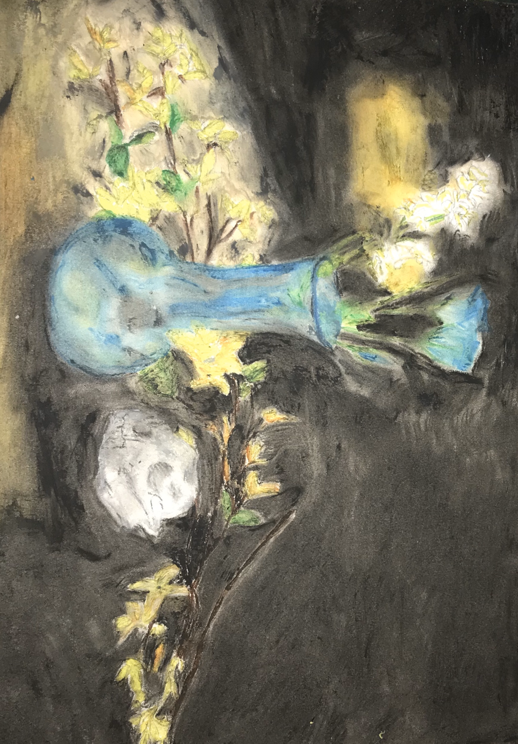
Artwork: Oil Pastel
|
Title: M30
|
Exhibition Text:
”M30¨ presents objects within a monotone setting that center around still life in both presence and use. As the objects used counter in natural and man made objects though still coexist amoungst each other. This presents my personal life, in what catches my eye. Sources of inspiration for the piece are Pieter Claesz´s ¨Vanitas¨ and Vincents van Gogh´s ¨Vase with Poppies¨. Both works served as inspiration for the presence and types of objects to be used for the piece. As each work showcases a still setting of objects, through a still life. This work does not manipulate external works.
Inspiration/Critical Investigation:
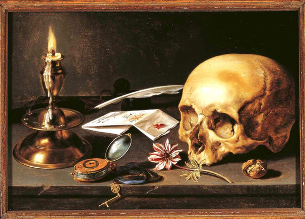
Claesz, Pieter. Vanitas. 1625. Oil paiting.Claesz is a still life painter who lived in Haarlem during the 1600's. Within this piece the tones are monotone and follow an overall dark sense. This is initially apparent through the black background, while the light contrasts this from the left, through yellow. The texture of the piece is rough and smooth depending on the object. As the background holds a rough texture. While the brass holds a smooth texture. In general each object holds there own presence, and there is a lack of overlapping objects. The objects and the piece are highly reflective of the source of light from the candle. This adds to a level of depth of the piece as each object holds various tones, due to the presence of a source of light. As a still life painter, Claesz follows the basic rules of a still life, through the positioning, light source and objects. This particular still life was done early within his career, thus it lacks depth in presence. As there are a limted number of objects within the piece, and space.
This piece was made by Claesz from the golden age of Dutch paintings, which are from the Delft School. As his works contained domestic objects, which can be seen in the source of inspiration. His works focus on detail, and presenting reality. The objects within the piece of inspiration, are varied which present artistic experimentation of common objects. |
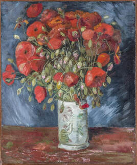
van Gogh, Vincent. Vase with Poppies. 1886. Oil on canvas.Vincent van Gogh was a Dutch post impressionism painter who resided within Europe within the late 1800's. His works have expressive brushstrokes and focus on presenting ones reality rather than replicating it. Thus his works lack in detail though excel in ones form. Vase with Poppies, inspired the piece that was made. This is a still life which holds one center focus on a vase. These is no other external objects present within this piece. Despite the simplicity of the object the piece still vibrates with energy. This can be seen built by the shadows, highlights, strokes and color of the piece. There is a contrast in colors that the work holds between red and blue. As the poppies hold a vibrant red, whilst the vase, background and other flowers follow a cool blue tone. This contrast present within the work through color, draw out more attention to the poppies.
This piece is suspected to be made by van Gogh when in Paris, France. This work was also made later within his life as he did die in 1890. The work showcase envelops flowers that connect with one another and overlap. While the vase itself holds a singular form. This builds another contrast from the top and then the bottom of the piece. |
Planning:
|
|
|
Process/Techniques/Experimentation:
Process
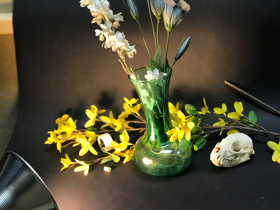
In order to begin making the still life I first had to set a scene for the piece to be present within. I made a mock setting for the picture to be taken. I intally began with acuring the objects to be used for the final piece, I already knew what main objects I wanted to used though had to assort them. I also needed to create a backdrop for the still life, in order for this to hold true to being a simple still life. I used black paper for the background and the floor of the setting. I also needed a source of light for the piece, so I used a light bulb which can be seen in the top left corner in the first image. The second image shows the setting in its true light and tones. This even shows how I hung the paper with tacks on a wall in order for them to stay in place. When taking the photos I messed with the lighting and the placement of various aspects. This includes the lighting, location of camera, objects and the focus of the photo. These varying aspects allowed for different points of the setting to be presented. The first image shows the final image that was used for the piece.
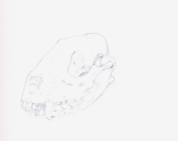
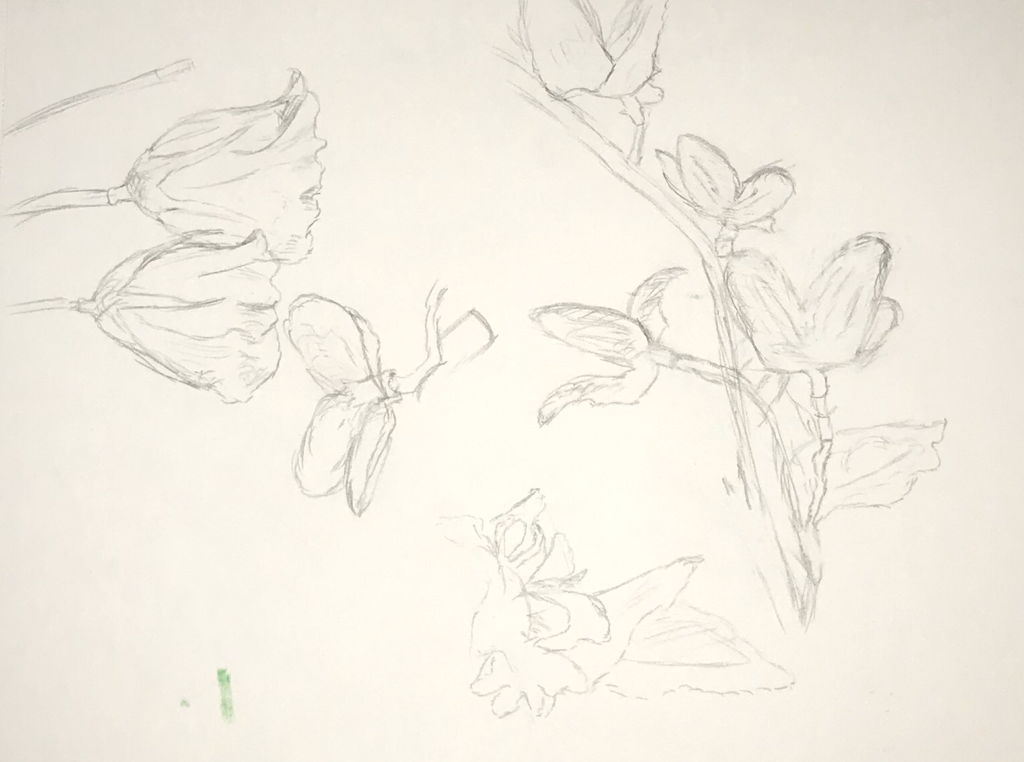
When the final photo to be used for the piece was taken and chosen out of the rest taken, I began the sketching of the still life on smooth paper. This type of textured paper was used opposed to rough, to allow the oil pastels to better mix and appear on the paper in the final piece. The initial sketch of the piece was done with a lead pencil and outlines the aspects to be present within the piece. I was used a printed photo and close ups of the objects used, in order to gain more detail. This not only focused on the objects but areas of color change and light. This particular photo chosen for a guide had a lack of depth in the background, though presented various dark tone on the objects. Images three and four show the process of the sketch and the final that was used as a guide prior to coloring with the oil pastels.
The final step of the piece was to color it with the oil pastels, which focused on tone and texture. Two different brands where used when making the oil pastel, which were oil pastel and Marvy. Each brand served there own benefit and where used cohesively for the work depending on there strength. The process of the coloring can be seen within the final two images. As I chose to work from the right background, forwards.
Techniques
Blending served as a major technique when making this oil pastel, as I was aiming for a smooth texture, rather than a harsh one. This was especially achieved through blending the colors after they were applied. Blending also allowed for me to mix colors onto the paper and create new shades. This was helpful as limited shades were available to use. Overall blending allowed for the entire piece to be cohesive.
Another process I found helpful when making the piece, was coloring the foreground objects first rather than the background. A harsh black was used for the background which opposed all colors in the front. This was appernet through the yellow flowers, though this did not serve as a major downfall. As the overall tone of the piece was dark, thus the background served as a further shadow. Thus coloring the foreground objects first gave a base tone. It was also best not to create the wanted finished tone and depth first, as the background and other colors do natural blend.
Another process I found helpful when making the piece, was coloring the foreground objects first rather than the background. A harsh black was used for the background which opposed all colors in the front. This was appernet through the yellow flowers, though this did not serve as a major downfall. As the overall tone of the piece was dark, thus the background served as a further shadow. Thus coloring the foreground objects first gave a base tone. It was also best not to create the wanted finished tone and depth first, as the background and other colors do natural blend.
Compare and Contrast (Evaluations)
|
Similarities
-They are both still life, which use objects in a static position. The similar objects used are a skull and flowers. In both the objects are played out in an array, rather than a singular line. There is a presence of both man made and natural objects. -There is no center focus in the piece, which leaves the viewer to bounce there eye across the work. This is also both done within a landscape position. -Both works use the lights as a form of creating shadow and depth for the work. As the light brings yellows and highlights the shadows of the work. This is done by bringing a contrasts, through the use of light. Differences -The mediums are different as Claesz work is an oil painting while mine is an oil pastel. This allows for different texture, form and presentation of the work. -The source of light is present within the work and can be clearly be seen amongst the objects. This is shown through the use of a candle. While I used a light bulb as a portable luminary, which is not mainly present within the work. -There is a minimal focus on the flowers, as Claesz's work only shows one singular flower, as the man made objects overpower the works. While the opposite occurs within my work. |
Similarities
-They are both still life which use static objects. There is also a correlation in that both works use flowers within a vases. -There is a focus on expressive strokes, which present a feeling. These both stray away from replicating reality in order to achieve a unique work. -In both works there is a presence of life through the use of the flowers. The flowers also mingle with one another, rather than being singular. Differences -The vase is not the center focus of my work, and is not within the center position. -The mediums of the piece differ as the source of inspiration is an oil painting. While my work is and oil pastel on paper. These different mediums present different textures based on the tools used. -This work uses cool tones, with a contrast of red within the poppies. though my work focuses more on a yellow and dark contrast. As van Gogh's work present vibrant color and does not focus on the dark of shadows. |
Ideas
|
|
The planning concepts show the basic ideas for the piece. These served as both brainstorming and outlining. As I outlined the aspects of the inspirational work and there key factors. This mainly analyzed the works briefly. This did not outline what inspired my piece.
I also outlined the aspects of my work and what needed and wanted to be done. This included the needed material for the work. the aspects for the photo were also outlined. The base wants for the piece such as the medium and type of work were also presented. As this served as initial brainstorming for the work. |
Experimentation
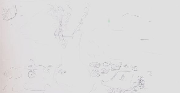
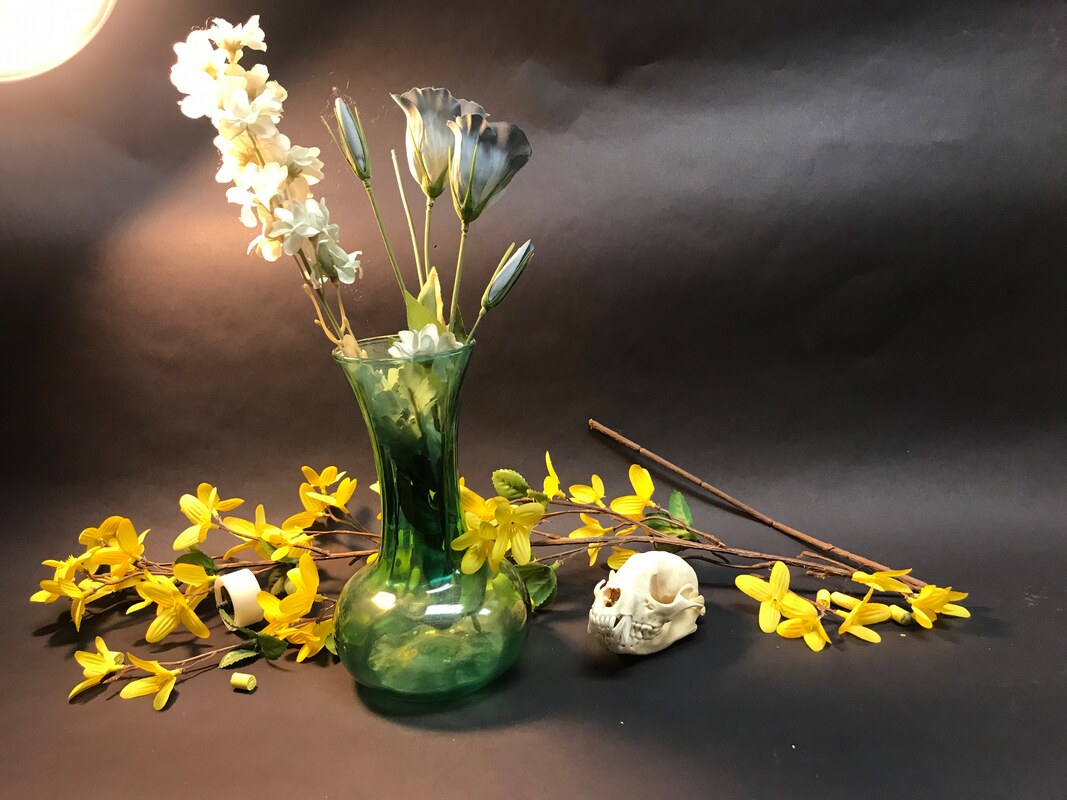  There was experimentation done with the photography of the piece. As various placements of lighting and the objects where done. The image above displays an over exposed image. This lead to the top left corner of the light creating a sort of blur, with the white flowers. This focus on the lighting also brings more lighting to the overall piece. The positive of this image is the various levels and tone present within the background. Though the downfall of this image, is the lost of depth within the foreground objects. As there is just one solid bright shade on some of the objects. This was apparent in the other image taken, as each held pros and cons. Thus experimentation was done with, taking various photos.
|
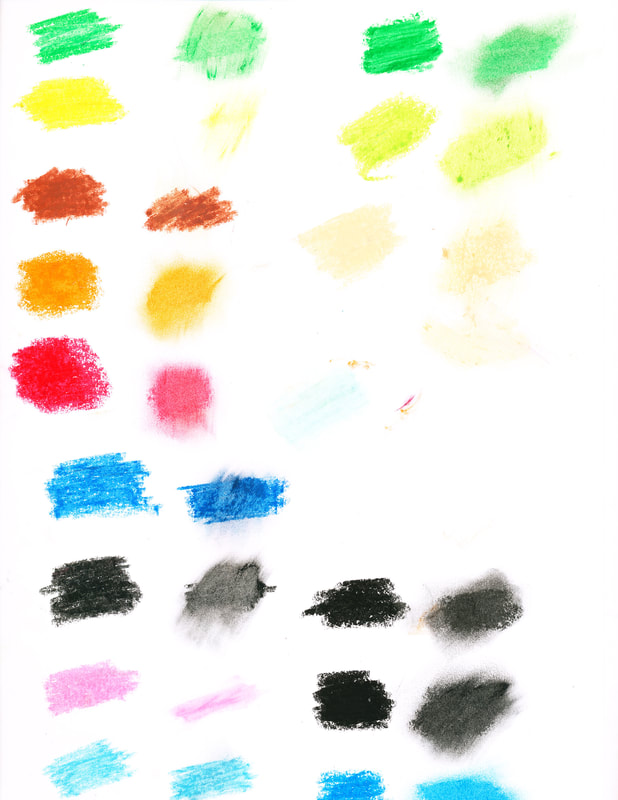
Experimentation was conducted, with the values and colors of the oil pastels. Two different brands of oil pastels where used in making the piece. Marvy provided more of a harsh texture when applied, though there colors held more dark tones. This is apparent between the shades of green. As the other oil pastels, green is a lighter shade. When doing the leaves in the piece I used the light green form the oil pastel brand and then the green from Marvy. I then proceeded to mix this two colors for the piece. This experimentation allowed me to properly view the value and color of each color. I was also able to view how each oil pastel appeared on the paper. This was done both for the base and smudged color. This swatches of colors provided as a guide for the final piece.
|
Reflection:
In reflection to the piece made and process, there were areas of success and failure. To start I found the process for making the photo for the still life full of experimentation. As when making the photo I found the various impacts that the light position had on the objects. Though at the end I found that I was successful in achieving a photo that met my base requirements for a still life. Throughout making the piece I found out more about working with oil pastels and how them mix and apply. As when working with the pastels I was able to achieve I smooth appearance while also mainting expressive texture. Though a challenge I found when making the work was the skull. Initially to even draw the skull, I had to take time to build depth and follow the detailed bones. Then when coloring the skull I have to lightly use dark alongside whites in order to build shadows and depth. This led to some slight difficulty as the oil pastels have a tendency to smudge. Hence I had to be careful when coloring and sketching the skull for the final piece. Overall the work made allowed me to strengthen my skills, by observing reality and sketching its details and coloring in order to highlight depth.
ACT:
Clearly explain how you are able to identify the cause effect relationship between your inspiration and its effect on your artwork?
-The inspirations effected the base premise of my work, through the use of a still life. This lead to it effecting the stance and objects used within my work.
What is the overall approach the author has regarding the topic of your inspiration?
-Claesz focus on depicting lights effect of on reality, which is presented through close up of detail. Vincent van Gogh showcases an expressive still life that holds vibrant colors.
What kind of generalization and conclusions have you discovered about people, ideas, culture, ect. while you researched your inspiration?
-The sources of inspiration both held a Dutch background, which lead me to believe that they appreciate still lives. This is also done with man made and organic objects such as flowers and skulls.
What is the central idea or theme around your inspirational research?
-The central idea around my research focused on still lives and there presence that they hold. As both sources of inspiration and still lives with artist of a dutch background.
What kind of inferences did you make while reading your research?
-I made some inferences on Claesz as there was limited information about him, so I had to infer more into his work rather than impacts. This lead me to believe Claesz made the piece of inspiration as a valued work more then a form of training his technique.
Bibliography
Asano, Inio. (2007). Oyasumi Punpun. Vol. 1. Tōkyō: Shōgakkan
Magritte, René. "René Magritte Baucis Landscape (Paysage De Baucis) 1966." Lee Bontecou. Untitled. 1959 | MoMA. Accessed November 24, 2018. https://www.moma.org/collection/works/73659 .
Magritte, René. "René Magritte Baucis Landscape (Paysage De Baucis) 1966." Lee Bontecou. Untitled. 1959 | MoMA. Accessed November 24, 2018. https://www.moma.org/collection/works/73659 .
